
As a graphic designer and self-professed graphics nerd, I absolutely adore seeing easy-to-use photo editing programs. Especially when they’re free(ish).
When I started Bookstagram, I was working exclusively with my good ol’ trusty photo editors. At the recommendation of many friends, I decided to give Canva a try. Now let me tell you, I was impressed. It was an incredibly intuitive tool that really took out a lot of the guesswork that you’d get with other photo editors. I love this, because it makes the barrier to entry far less daunting, enabling people to create their own gorgeous, professional-looking images (even those who wouldn’t consider themselves particularly artistic).
I’ve been seeing so many gorgeous quote images floating across my feed and I’ve been so happy to see them.
For those of you who don’t know where to start, I figured I’d whip up this quick and simple tutorial. And who knows, maybe those of you who’ve been fiddling with Canva might find some inspiration or learn something about how someone else does their work!
I’m going to show you how to make a simple quote image:
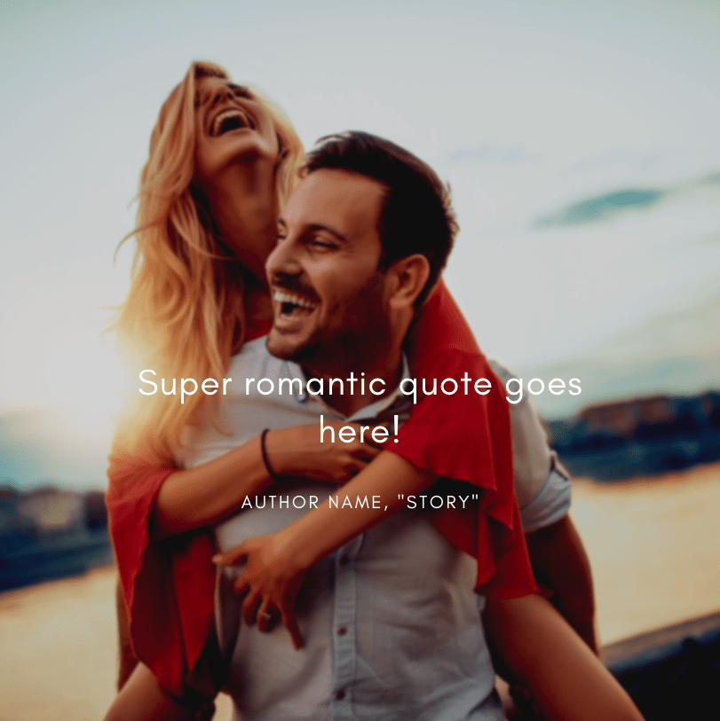
Looks pretty straightforward, right? I’d like to say that it’s just a matter of selecting an image and putting text over it, but oftentimes, it requires a bit of finessing. I promise, it sounds more intimidating than it actually is! So, let’s start at the beginning!
From your home page, you can start a new design in a few ways.


The first way: Top Navigation > Create a Design > Select Appropriate Template (We are using Instagram Post)
The second way: “What Will You Design” Header > Social Media > Instagram Post
The third way: Top Navigation > Templates > Instagram Posts > Create a Blank Instagram Post/Select a Template
Now that you have a blank document, you can add a background image. You can upload your own from your desktop, select an image from Canva’s stock images, or pre-selected backgrounds by using the navigation along the side. This image was found in their stock photos.
Select the image you would, and drag it over to the canvas. The image should snap to the background. If it does not, you can make it the background by right-clicking and selecting, “Set Image as Background.”
It’s time to add our text! Using the left-hand side navigation, you can find the text options. You can select between heading, subheading, and text. Or! You can scroll through their offered font combinations until you find something you like. I went for a pre-made one because… Well, if it ain’t broke.
Now, let’s take a look at it!

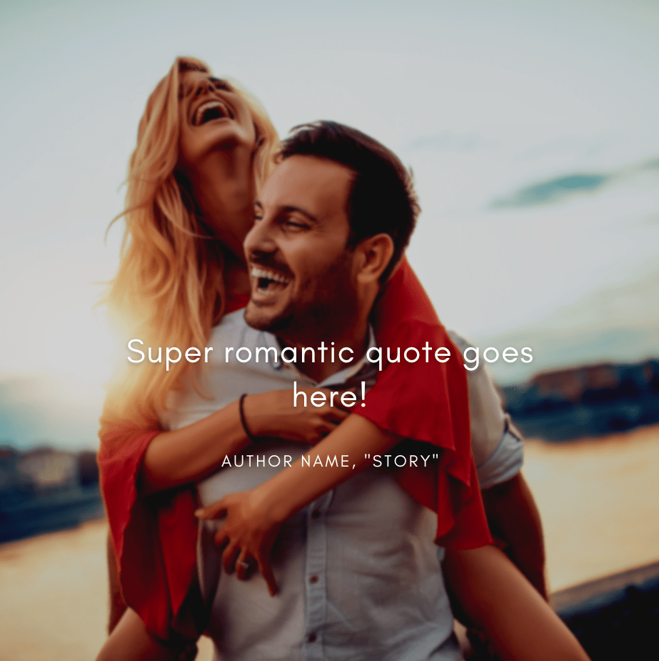
Ohhhh no no no-no. We cannot have that! The background is too light and it’s making it difficult to read some of text! We don’t want that! We want it to be legible. Let me show you how to fix that!
First things first, you’re going to want to select your image by clicking on it. You’ll know what is selected because a beautiful blue border will form around it. Once you’ve selected the post, you will see an option on the top bar to edit the image. Click on that, and you will see a list of options. In this tutorial, I’m focusing exclusively on adjusting the image. So! Let’s take a look at the Adjust Options, shall we?


First, there is brightness. Brightness changes the overall… well, the brightness of the image. This is perfect in these situations where you want lighter text to stand out. So, let’s set the brightness of this image to -30!

Looking good, but not quite what we’re looking for quite yet. Let’s go play with some contrast!
Contrast is, simply put, is the contrast between light and dark colors. The less contrast an image has, the less shade variation there is. This is yet another tool in your arsenal for priming a light image for light text. Let’s take a look at how contrast changes the image.
Now that we know what Contrast does, let’s set this to -21 and take a look!

You’ll see there is a third option, and that is Saturation! What is Saturation? It is just another way of describing the intensity of the colors in the image. So, the higher the saturation means more vibrant colors, whereas, the less saturation, the less colors (gray). Let me show you!
Cool, right? With this particular image, I don’t feel like we need to play that much with saturation, so let’s just give it a good ol’ 2!

That’s looking really nice!
Now that the image is primed and ready for contrast, I can do a bit more playing around to make it exactly how I like.
I find that another way to make text stand out is to add a blur on the image, so I’m going to add a very small one here.

It’s just missing one last thing! A text shadow!
I can create one (or play with other text effects) by selecting my text layer, clicking the three-dot menu, and selecting “Effects.” In this particular image, I used, “Lift” set at the default 50!
If this helped you in any way, please let me know! And if you’re interested in seeing more Canva tutorials, feel free to comment below/tag me on Instagram! I want to see your Canva creations if you’ve followed this tutorial!
If you liked this blog, please give it a like, a comment, and share it with your friends! It really does help a lot! For more blogs like this, subscribe below to be notified of my next post! You can also follow me on Instagram, like my Facebook Page, or follow me on Goodreads!
